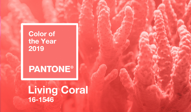
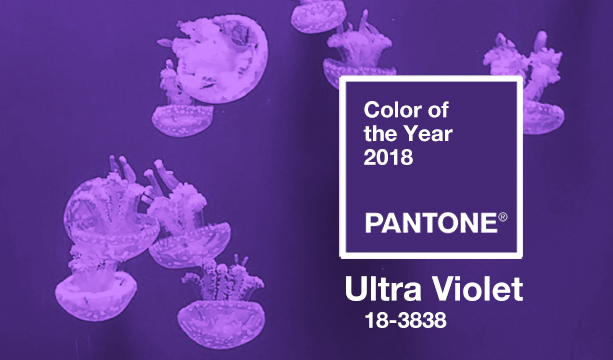
Pantone Color of the Year – Classic Blue
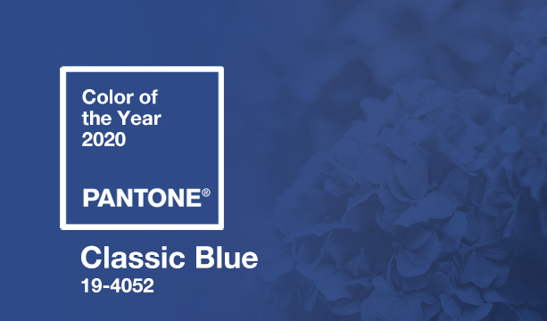
Classic Blue (PANTONE 19-4052) is Pantone’s color of the year for 2020, “a timeless and enduring blue hue, … [it] is elegant in its simplicity.”
Leatrice Eiseman, Executive Director of the Pantone Color Institute® continued: “We are living in a time that requires trust and faith. It is this kind of constancy and confidence that is expressed by PANTONE 19-4052 Classic Blue, a solid and dependable blue hue we can always rely on. … Classic Blue encourages us to look beyond the obvious to expand our thinking.”
Looking a lot of client’s color palettes, I agree with the appeal of a classic and calming blue.