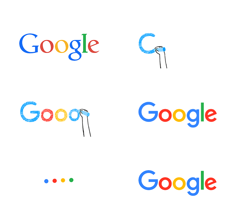
Google’s homepage introduced a new sans-serif logo today – the biggest redesign since 1999. Small screens and readability on all devices have been a major consideration, with modern typography (a new Google specific font called Product Sans) that scales better to smaller sizes for easier reading.
“This isn’t the first time we’ve changed our look and it probably won’t be the last, but we think today’s update is a great reflection of all the ways Google works for you across Search, Maps, Gmail, Chrome and many others. We think we’ve taken the best of Google (simple, uncluttered, colorful, friendly), and recast it not just for the Google of today, but for the Google of the future” the company stated on it’s blog.
Google also changed their icon – instead of the blue “g” – an uppercase “G” in Google’s four colors will be displayed, which many are saying will become “people’s primary association with Google going forward.”
The video below recaps the evolution of Google and it’s logo – the way people interact with Google today across many different platforms, apps and devices.
New logo animation & video via Google
