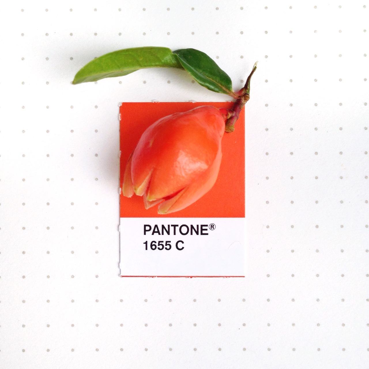
Pantone Color of the Year – Living Coral
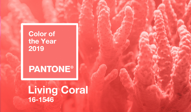
It’s that time of year. Pantone announced it’s color of the year for 2019 – Living Coral (PANTONE 16-1546) and described the color as “An animating and life-affirming coral hue with a golden undertone that energizes and enlivens with a softer edge.”
On their website the Pantone Color Institute® describes it as “glorious” and “mesmerizing to the eye and mind.”
“Color is an equalizing lens through which we experience our natural and digital realities, and this is particularly true for Living Coral.”
– Leatrice Eiseman, Executive Director of the Pantone Color Institute®
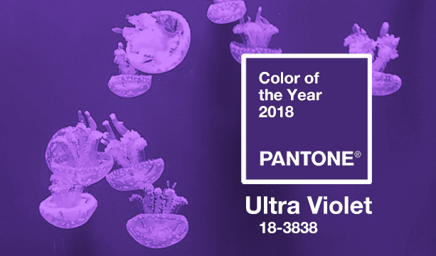
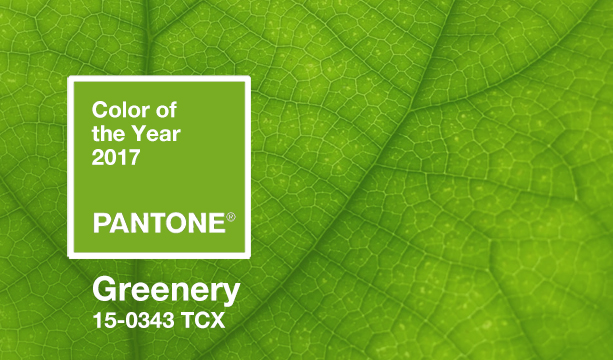
Unlike some previous picks – Marsala & Greenery come to mind – this year’s selection is not something that appears too often on my color palette.