Mistakes Happen…
via PetaPixel
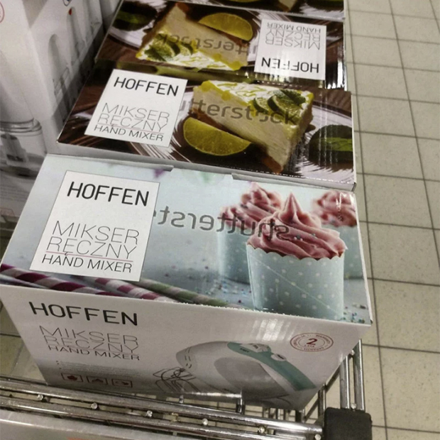
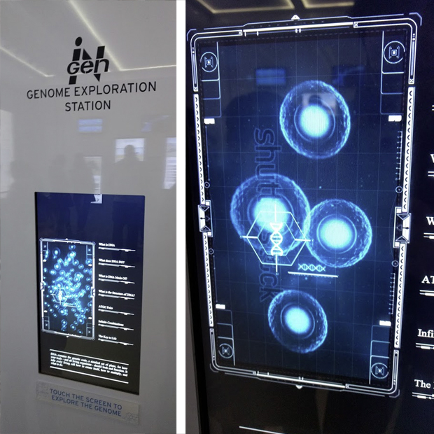
Stock photos apparently are forgotten more often than one would think. The top image was spotted in a Polish Supermarket, the below at an exhibition at the Franklin Institute.
via PetaPixel
Stock photos apparently are forgotten more often than one would think. The top image was spotted in a Polish Supermarket, the below at an exhibition at the Franklin Institute.
Until November 26 two large hands are emerging from the Grand Canal at the Ca’ Sagredo Hotel in Venice, as part of Italian artist Lorenzo Quinn’s monumental installation titled ‘Support’ which highlights the very real threat climate change causes to the city of Venice.
To quote an article from urmagazine: “Reflecting on the two sides of human nature, the creative and the destructive, as well as the capacity for humans to act and make an impact on history and the environment, Quinn addresses the ability for humans to make a change and re-balance the world around them – environmentally, economically, socially. Support sees Quinn reflect on and readdress these global issues by echoing the meticulous execution and technique of the Masters of the past to create a powerful and unique sculpture which will be displayed during the Venice Biennale 2017.”
The artist’s website currently features a video showcasing the installation process.
Support by Lorenzo Quinn – Venice Biennale 2017 from Lorenzo Quinn
Image via urdesign courtesy of Halcyon Gallery and Lorenzo Quinn
Drivers in Arizona have been greeted for the past few years with a running series of timely, humorous, holiday or pop-culture inspired roadway signs by the Arizona Department of Transportation. This January was no different with the suggestion of a new year’s resolution:
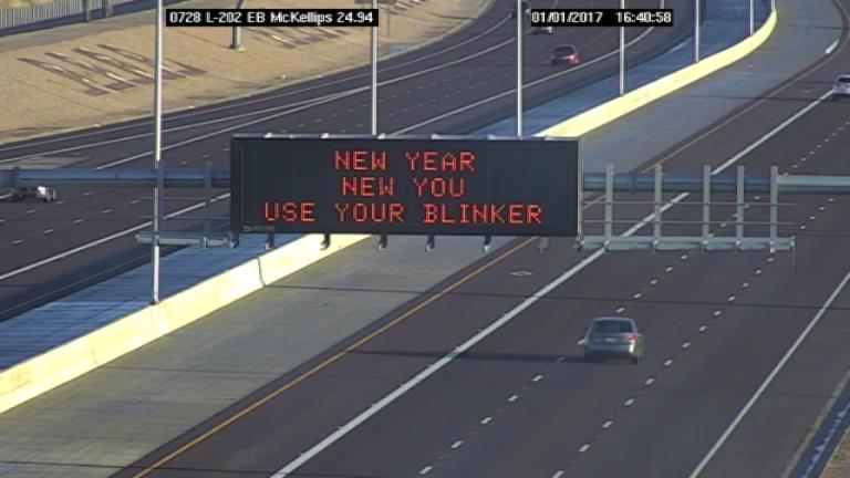
The tongue-in-cheek humor has attracted more than 156,000 followers on ADOT’s Twitter account. Below is a look back at some of the freeway signs posted in 2016:
Before we get too far into 2017, we thought we would take a look back at some of the freeway signs posted in 2016. #ADOT pic.twitter.com/JGABThlNRY
— Arizona DOT (@ArizonaDOT) January 1, 2017
In an interview with AZCentral, Tom Herrmann, one of the people who handles the @ArizonaDOT Twitter account said: “If we just talked about traffic and it was all dry, nobody would care. … We’re trying to get traffic information out there. If we do that and get a smile on people’s faces, that’s even better.”
Images via ADOT’s Twitter account
In their #MissingType campaign, London-based PR company Engine Group and NHS Blood & Transplant, tried to get people’s attention by eliminating the letters A, B and O from public landmarks and participating brands across the globe.
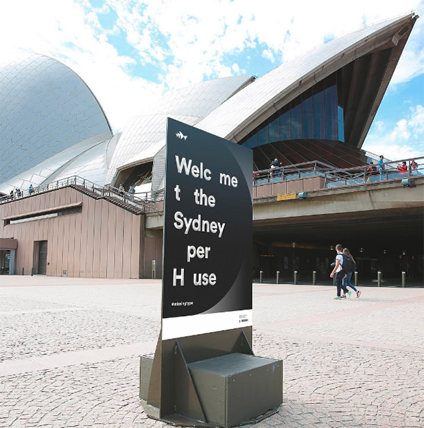
Image by Sydney Opera House via Instagram
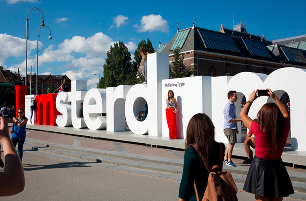
Image by Iamsterdam via Twitter
The (missing) letters – A, B and O – are used to identify the main blood types. The campaign hoped to reverse a decline in new donors and encourage blood donations to meet the need for blood in the future.
In honor of Mother’s Day, JetBlue gave passengers on a recent flight from JFK to Long Beach a reason to smile every time a baby cried.
An announcement was made at the beginning of the cross-country flight, that travelers would receive a 25% discount off their next ticket purchase every time a baby cried. In the end passengers applauded the babies who helped them get a free ticket.
Not designed to increase sales, but rather to create more compassion among travelers, JetBlue spokesman Morgan Johnston said, “We’re hoping to inspire … conversation and know that while it may be tough for you to sit next to a crying kid, we hope you can think about the stress that parent is going through,” he said. “And maybe we can be a little bit more supportive of moms.”
Another airline made passengers very happy for a different holiday.
For years Frigyes Karinthy’s 1929 theory of Six Degrees of Separation led us to believe that any two people are separated by just six degrees aka friendly acquaintances. But today – the day Facebook turns 12 and deemed “Friends Day” – they also just shrunk that number to 3.57.
According to VentureBeat‘s website, “In newly released statistics, Facebook claims that its services have reduced the degree of separation between users — now 3.57 degrees, compared to 3.74 degrees in 2011. The company interprets this is a sign that in the past five years, we’ve grown more connected globally, something it hopes to continue to advance through its various initiatives.”

To see how close or far removed from everybody you are on Facebook, log into your account and visit their “separation research” page.
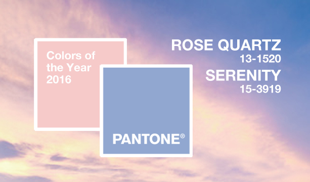
The Pantone Color Institute® – always up for a surprise this year – for the first time announced two colors of the year for 2016. While they are called “Rose Quartz” and “Serenity” they might have come straight from a baby announcement, as they are essentially shades of light pink and baby blue.
While Christina Binkley from the Wall Street Journal joked “It’s twins!” Pantone insists that is not the case.
“Rose Quartz is a persuasive yet gentle tone that conveys compassion and a sense of composure. Serenity is weightless and airy, like the expanse of the blue sky above us, bringing feelings of respite and relaxation even in turbulent times. … Joined together, Rose Quartz and Serenity demonstrate an inherent balance between a warmer embracing rose tone and the cooler tranquil blue, reflecting connection and wellness as well as a soothing sense of order and peace.” Leatrice Eiseman, Executive Director of the Pantone Color Institute was quoted on the company’s website.
Quite different than Benjamin Moore’s choice for the Color of the Year – Simply White – or Sherwin-Williams 2016 pick of Alabaster.
Republican presidential hopeful Ben Carson’s campaign shared a U.S. map on various social media platforms with several states positioned and shaped incorrectly – presenting a reimagined Northeastern United States.
As Citylab pointed out: “In Carson’s America, most of New England has broken free from its anchors east of New York, drifting so far up the coast that Connecticut is now as far north as Vermont. Massachusetts and New Hampshire are even farther north, falling solidly above Real America’s border with Canada. But that should come as good news to Vermont, which now gets miles and miles of prime beachfront property to the south and east.”
Image via Citylab