The Creative Brain

Creativity

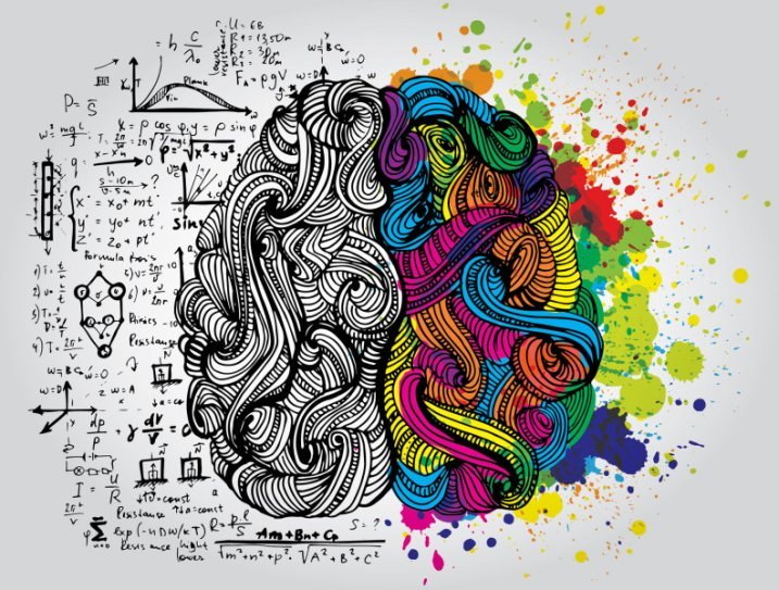
Recently the Benchmark Reporter covered a new Scandinavian study, published in Nature Neuroscience, which shows a genetic link between creativity and psychiatric disorders.

The results of the study revealed that people belonging from these artistic societies had 17% more chances of variants connected with mental health conditions compared to general people.

Study author Kari Stefansson, the founder and CEO of deCODE, a genomic analysis company, stated, “The results of this study should not have come as a surprise, because to be creative, you have to think differently from the crowd. And we had previously shown that carriers of genetic factors that predispose to schizophrenia do so.”

Of course this study was not the first to explore the subject, as there have been many others. One notable contributor would be Nancy C. Andreasen, a leading neuroscientist who has spent decades studying creativity and the origin of genius and why it is so often accompanied by mental illness.

For more on the subject, check out “Secrets of the Creative Brain” by Nancy C. Andreasen or learn more about the Scandinavian study here. For a correlation between creativity and boredom watch this video.

Image via Benchmark Reporter | Video is a preview of a PBS News Hour segment about Nancy Andreasen via The Atlantic

2017-05-22T13:16:59+00:00 June 16th, 2015|Big Thinking, Design|Comments Off on The Creative Brain

Judging a Book by it’s Cover Tin

We are all familiar with the English idiom “don’t judge a book by its cover” and while the metaphorical phrase applies to lots of aspects of life, I am certainly one to judge books by their outward appearance alone.

Having said that, Maria Mordvintseva-Keeler’s Food for Thought Book Collection, which includes “Breakfast at Tiffany’s,” “Naked Lunch” and “Dinner at the Homesick Restaurant” in a tin can packaging, is most certainly a feast for the eyes.

book-covers-tin-concept-1

book-covers-tin-concept-2

book-covers-tin-concept-3

book-covers-tin-concept-4

Images via Behance

2017-05-22T13:16:59+00:00 June 8th, 2015|Design|Comments Off on Judging a Book by it’s Cover Tin

Getting The Point Across – The Power of Presentations

While plenty of PowerPoints presentations have a reputation to bore people to tears, they are still widely used to distribute information. And a great presentation can get the point across, while holding the audience’s attention. To help out, Udemy, the place to learn real world skills online, put together this infographic:

PPT Udemy Infographic

2017-05-22T13:16:59+00:00 May 26th, 2015|Design, Humor, Inspiration|Comments Off on Getting The Point Across – The Power of Presentations

Set Them Free

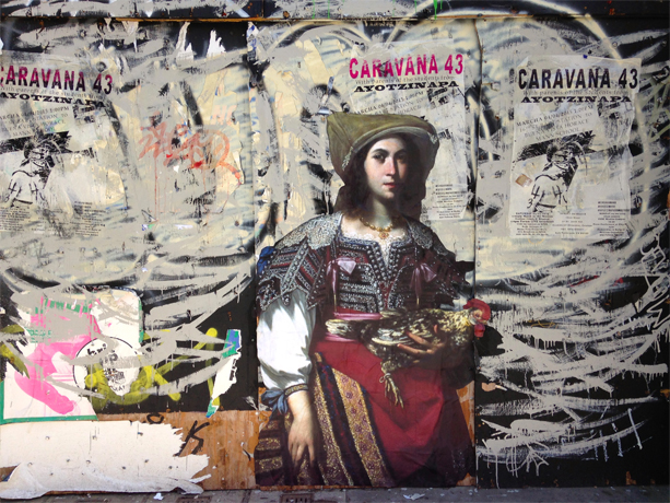
The Outings Project was started by the artist and filmmaker Julien de Casabianca, after he visited the Louvre last year, noticing a lone painting in a back corner. Wanting to get the painting seen and appreciated by people who may never visit the museum, he made a copy of the painting and pasted it on a public street.

Since setting free the first painting, people in several cities have followed suit, turning this into a participative project, which Casabianca says, was not the original idea, but one he embraces.

Below are some favorites that have popped up in the project gallery:

Outings Project

New York, USA – The Metropolitan Museum of Art

Outings Project

San Francisco, USA – De Young – Legion of Honor, Fine Art Museum of San Francisco

Outings Project

Frankfurt, Germany – Städel Museum

Outings Project

Warsaw, Poland – Muzeum Narodowe w Warszawie

Images via The Outings Project

2017-05-22T13:16:59+00:00 May 12th, 2015|Big Thinking, Design, Humor|Comments Off on Set Them Free

Blindfolded – or – The Unique Connection

Pandora Jewelry released The Unique Collection along with a two-minute spot by Danish agency Malling Publications, in which a group of blindfolded children are supposed to pick out their mothers based on their unique features. The video tries to prove that all women are unique, whether they’re a mom or not, just like Pandora’s jewelry.

2017-05-22T13:16:59+00:00 May 8th, 2015|Videos|Comments Off on Blindfolded – or – The Unique Connection

#everybodysready

A controversial advertisement by Protein World, which appeared in London Underground stations, promoting ‘The Weightloss Collection’ has caused quite a stir. The ads featured Australian model Renee Sommerfield in a yellow bikini asking “Are You Beach Body Ready?”

Protein World Beach Body Ready

Image via Time.com

According to Time, a petition with more than fifty thousand signatures was looking to get the billboards removed. The British Advertising Standards Authority has received over 200 complaints that the ad is “offensive, irresponsible and harmful because it promotes an unhealthy body image.”

Pictures of defaced posters have gone viral on Twitter under the hashtag #everybodysready, and while body image campaigners and feminists have been condemning the campaign, some companies have created their own ads in response.

Dove answered “Yes. We are beach body ready.” showing off curvy, bikini-clad women.

Dove Beach Body Ready

Image via Daily Mail

Carlsberg beer bought up billboard spots in close proximity, with a beer bottle sporting a yellow bikini bottom asking “Are You Beer Body Ready?” – adding the hashtag #probably.

Carlsberg Beer Body Ready

Image via Twitter

Others still are following suit, offering their take on beach perfection…

Beach Book Ready

Image via Twitter

2017-05-22T13:16:59+00:00 May 5th, 2015|In The News|Comments Off on #everybodysready

Google’s Mobile Boost

Design Six Degrees - Mobile FriendlyAs more and more people search on their mobile devices, Google is trying to ensure that visitors can not only find content that’s relevant, but also easy to read on mobile screens.

The tech giant gave mobile-friendly websites a boost on smartphones, after releasing drastic changes to its search algorithm, prompting the web to declare “Mobilegeddon.”

Some of the criteria to meet Google’s mobile standards include the ability to adjust for smaller screens (either through responsive design or detecting a mobile device and redirecting visitors to a dedicated mobile page), videos that are optimized for mobile, text which is large enough so visitors can read without zooming or horizontal scrolling, as well as links that can be easily clicked on touch screen devices.

While this latest change only impacts searches conducted on smartphones – desktop searches will be unaffected – it is important to keep in mind that mobile searches equate to about half of all Google queries these days.

Now you might think that Google is not the only search engine out there, but according to CNN Money, two thirds of the US search market is controlled by Google.

“…The top spot on a search page typically attracts 20% to 30% of the page’s clicks, according to Adam Bunn, SEO director of digital marketing agency Greenlight. After that comes an enormous tail-off: Positions two to three generate 5% to 10% of the clicks, and links below that receive less than 1% of users’ attention.”

But not all is lost, even if your site is not mobile friendly at this point – content is still king, which is another vital factor in Google’s calculations. Plus, once you implement the changes to your site, you should see improvements to your ratings within a few days.

NPR sited a study done by online marketing firm Portent, which found that a majority of the Web’s top sites, 10,000 out of the top 25,000 sites, actually aren’t mobile friendly.

How does your site fair? Take the test and connect with us, should you need to make some adjustments to your website.

UPDATE: During the AdWords Performance Summit on May 5th Google announced that mobile search queries have now surpassed desktop queries in 10 countries, including the United States.

2017-05-22T13:16:59+00:00 May 1st, 2015|In The News|Comments Off on Google’s Mobile Boost

Pantone’s Newest Color Addition – Minion Yellow

Pantone’s Newest Color Addition – Minion Yellow

Pantone announced the release of its newest color – Minion Yellow – based on the bespectacled and bright yellow little creatures in the Despicable Me movies, which marks Pantone’s first ever movie-inspired color release.

“Color is contextual and right now there is a desire for colors that are more vibrant and uplifting,” Pantone Color Institute vice president Laurie Pressman said in a news release. “This is especially the case with the yellows, so given the worldwide popularity of the Minions, it seemed only natural to name a color after a character for the first time in our history.”

For obvious reasons this is another color we can give two enthusiastic thumbs up.

Minions picture was created with image from Pantone Color Institute

2017-05-22T13:16:59+00:00 April 23rd, 2015|Design, Humor|Comments Off on Pantone’s Newest Color Addition – Minion Yellow

Great Book. Tiny Ad.

The Great Gatsby. Tiny Ad.

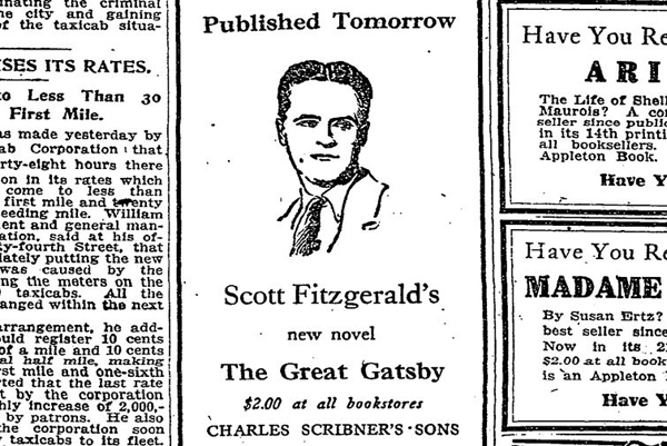
The ad for F. Scott Fitzgerald’s novel. April 9, 1925 (The New York Times/TimesMachine)

Fitzgerald’s The Great Gatsby, which has been called the great American novel, was published 90 years ago yesterday. The day before its launch, the above ad was published among many others. (See the full issue at TimesMachine.)

Although the book received a strong review in the Times and later got a larger ad, The Great Gatsby was not the success it eventually became during Fitzgerald’s lifetime. According to Vox, until his death Fitzgerald had earned a little over $13 in royalties in addition to his $2,000 advance. For comparison – the most recent Great Gatsby movie took in more than $351 million in theaters worldwide.

The Great Gatsby. Tiny Ad.

The full page on April 9, 1925, with an ad for The Great Gatsby tucked away. (The New York Times/TimesMachine)

2017-05-22T13:16:59+00:00 April 11th, 2015|Design|Comments Off on Great Book. Tiny Ad.