First Class Design

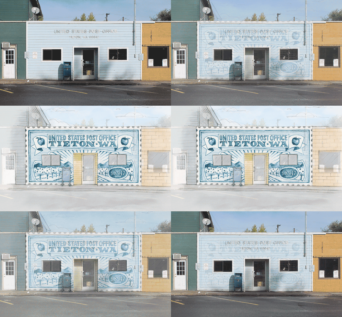
How cool would this have been? A small post office in Tieton, Washington was supposed to get a new facade consisting of 41,500 stamp-size glass mosaic tiles, commemorating the look of vintage postage stamps from the early 20th century.
Tieton Post Office Design

Image via Kickstarter | Tieton Stamp Mosaic: A Monument to Small-Town Post Offices

The Kickstarter campaign had initially raised enough money, but the USPS declined the offer, with Ernie Swanson, U.S.P.S. communications field contact, stating “It’s just inappropriate, basically, for us to do that, to accept such gifts; we operate and maintain our own facilities.”

Luckily the town will still produce six typographic mosaics that will be installed around Tieton landmarks, as part of the Tieton Mosaic Project, which was funded in part by the National Endowment of the Arts. Ed Marquand, co-founder of Mighty Tieton (an incubator for artisan and design-related light manufacturing businesses), is behind the Tieton Mosaic Project and helming the revitalization effort of the small, agricultural community in central Washington.

2017-05-22T13:16:59+00:00 July 29th, 2015|Big Thinking, Design, In The News|Comments Off on First Class Design

Summer Refreshments

With summer comes the opportunity for marketing approaches that are out of the ordinary. Below are some fun campaigns that took summer refreshment to a new level:

Soda Machine Shower – In 2012 beach-goers in Brazil got to enjoy a refreshing taste of Sprite soda, along with a free shower! Sprite installed a giant (water – not soda) shower on the beach. By giving away samples, combined with the refreshing effects of a cool shower, the brand made people associate the flavor of Sprite with refreshment – a brilliant campaign!

 
Share A Coke

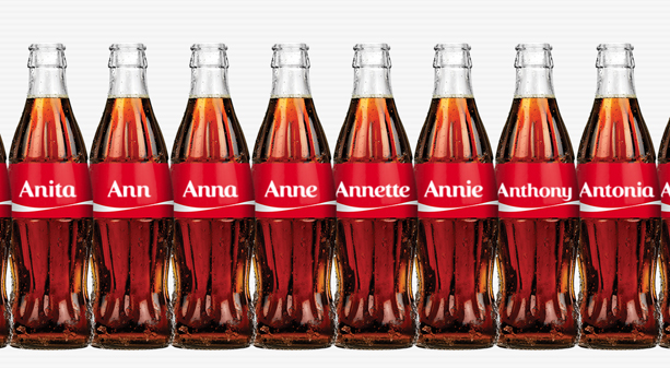
Share a Coke – Beginning in the summer of 2013, Coca-Cola made a big splash when it swapped its famous logo with the most popular names, so people could Share a Coke with the people who matter most.

“The campaign capitalised on the global trend of self-expression and sharing, but in an emotional way. Coke is big enough to pull off an idea like this, which speaks to the iconic nature of the brand.”Marketing Director Lucie Austin

 
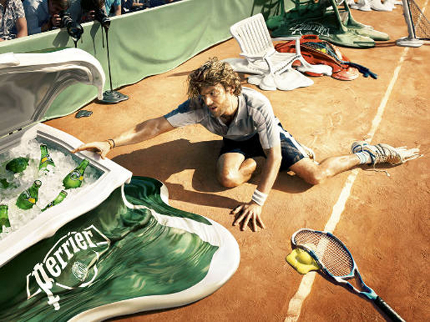
Perrier

Heat Resistant Water – Back in 2009 Perrier presented itself as the drink that can withstand melting temperatures. Bottles of Perrier appear as cool as ever in the heat blistering environments of the tennis court, the night club and beach. The campaign won a Silver Press Lion at Cannes International Advertising Festival 2009.

 
mettre-alimentos

Hot Dog Legs – Not a beverage advertisement, but one that plays on a favorite summer meme, Mettre Alimentos based its summer ads on the “hot dog legs.”

Coke image via Share A Coke | Perrier image via The Inspiration Room | Mettre Alimentos image via Creative Awards

2017-05-22T13:16:59+00:00 June 29th, 2015|Big Thinking, Design, Humor|Comments Off on Summer Refreshments

The Creative Brain

Creativity

Recently the Benchmark Reporter covered a new Scandinavian study, published in Nature Neuroscience, which shows a genetic link between creativity and psychiatric disorders.

The results of the study revealed that people belonging from these artistic societies had 17% more chances of variants connected with mental health conditions compared to general people.

Study author Kari Stefansson, the founder and CEO of deCODE, a genomic analysis company, stated, “The results of this study should not have come as a surprise, because to be creative, you have to think differently from the crowd. And we had previously shown that carriers of genetic factors that predispose to schizophrenia do so.”

Of course this study was not the first to explore the subject, as there have been many others. One notable contributor would be Nancy C. Andreasen, a leading neuroscientist who has spent decades studying creativity and the origin of genius and why it is so often accompanied by mental illness.

For more on the subject, check out “Secrets of the Creative Brain” by Nancy C. Andreasen or learn more about the Scandinavian study here. For a correlation between creativity and boredom watch this video.

Image via Benchmark Reporter | Video is a preview of a PBS News Hour segment about Nancy Andreasen via The Atlantic

2017-05-22T13:16:59+00:00 June 16th, 2015|Big Thinking, Design|Comments Off on The Creative Brain

Set Them Free

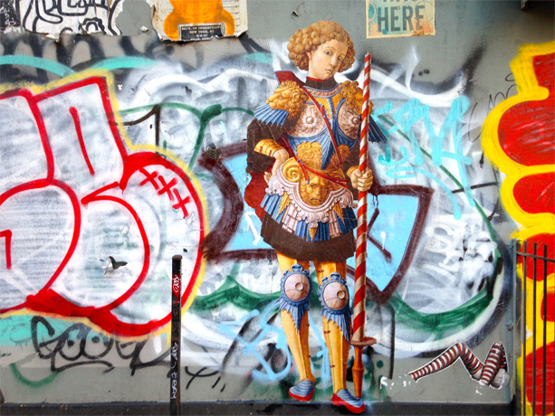
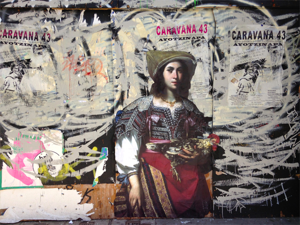
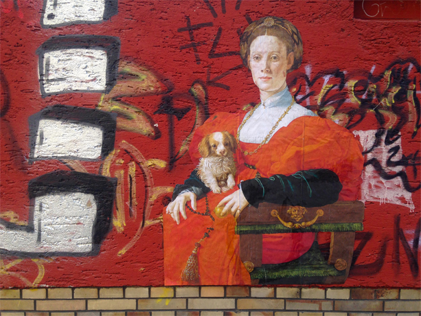
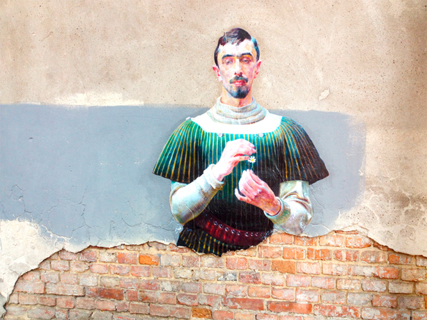
The Outings Project was started by the artist and filmmaker Julien de Casabianca, after he visited the Louvre last year, noticing a lone painting in a back corner. Wanting to get the painting seen and appreciated by people who may never visit the museum, he made a copy of the painting and pasted it on a public street.

Since setting free the first painting, people in several cities have followed suit, turning this into a participative project, which Casabianca says, was not the original idea, but one he embraces.

Below are some favorites that have popped up in the project gallery:

Outings Project

New York, USA – The Metropolitan Museum of Art

Outings Project

San Francisco, USA – De Young – Legion of Honor, Fine Art Museum of San Francisco

Outings Project

Frankfurt, Germany – Städel Museum

Outings Project

Warsaw, Poland – Muzeum Narodowe w Warszawie

Images via The Outings Project

2017-05-22T13:16:59+00:00 May 12th, 2015|Big Thinking, Design, Humor|Comments Off on Set Them Free

Creativity & Boredom

We all had that moment in the shower, when something we had pondered finally clicks. It’s the wandering of the mind that let’s our brain take a different look at a problem. But as many have noticed lately, in the age of connectivity, we hardly have time any more to be bored.

The Atlantic’s Dr. James Hamblin explores the link between creativity and boredom in another installment of his off-beat perspectives on health topics in the IF OUR BODIES COULD TALK series.

2017-05-22T13:16:59+00:00 February 12th, 2015|Big Thinking, Inspiration, Videos|Comments Off on Creativity & Boredom

Image vs. Perception

D6˚ in the Mirror - Image vs. PerceptionThe way you think of your business and the way your customers perceive your business may be fundamentally different, which is why it is essential for every business to develop a strategic marketing plan and stick to it.
1. Start with your mission.
What is the purpose of your company? What benefits, such as products or services do you offer customers?

2. Be honest with yourself.
Reflecting on your strength and weaknesses will help you define the core of your business. Outlining opportunities and threats will explore external influences on your business.

3. Outline stages for success.
Set objectives you want to achieve in the near future, keep goals in mind for the long-term.

4. Define your target audience.
Who are you trying to reach? Having a clear understanding of who your target market is may effect your business strategy.

5. Make a plan.
How do you want to approach your audience? Outline how you plan to reach your customers. Make it diverse.

6. Stick to it (for the most part).
Once you have a plan, try to adhere to it. Work on achieving the goals you set and do not rethink your strategies constantly. If you took an honest look at your company’s needs and goals you should be heading in the right direction.

Of course that doesn’t mean you should develop tunnel vision, revisit the goals you set periodically. Sometimes reaching your goals requires a few detours, but in general the course should be set. Let Design6˚ help you achieve your goals in 2015.

2017-05-22T13:17:01+00:00 January 2nd, 2015|Big Thinking|Comments Off on Image vs. Perception

Poetic Dogs

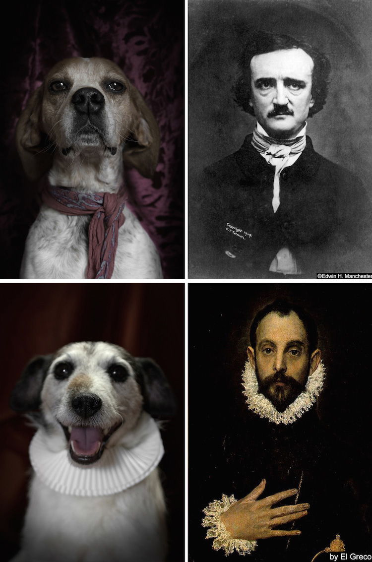
They say that people and their pets start to look alike after a while. Italian based photographer and dog lover Dan Bannino is running with the concept in his latest photography series, attempting to bring attention to shelters dogs by pairing dogs and famous writers.

Check out Edgar Allan Poe and Miguel de Cervantes below or visit Dan Bannino’s website for more poetic dogs.

Poetic Dogs

2017-05-22T13:17:01+00:00 December 12th, 2014|Big Thinking|Comments Off on Poetic Dogs

Today’s Special

Recently Radio Times with Marty Moss-Coane featured an interesting piece about the role of restaurant menus.

Talking to Stanford University linguistic professor Dan Jurafsky, the show examined the language used to describe food and the feelings associated with the sounds they make.

He was joined by Sybil Yang, an assistant professor at San Francisco State University’s department of Hospitality & Tourism Management, who talked about how menu designs can lead customer to choose certain items over others and the psychology behind it.

Listen for yourself:

How do you look at menus? Just something that will get you the food you want or a look at the soul of the restaurant?

2017-05-22T13:17:01+00:00 November 11th, 2014|Big Thinking, Design|Comments Off on Today’s Special

Lichtgrenze / Border of Light

This Sunday, November 9th, marks the 25th anniversary of the fall of the Berlin Wall. To celebrate the momentous occasion, a spectacular light installation will follow the route of the former wall.

From November 7th until the 9th approximately 9.5 miles of the former border, that once divided the city of Berlin, will be re-imagined in light with thousands of illuminated balloons.

The idea was conceived by the brothers Christopher and Marc Bauder and was supported by the Robert-Havemann-Gesellschaft e.V. and developed with the help of Kulturprojekte Berlin GmbH.

2017-05-22T13:17:01+00:00 November 4th, 2014|Big Thinking, Videos|Comments Off on Lichtgrenze / Border of Light