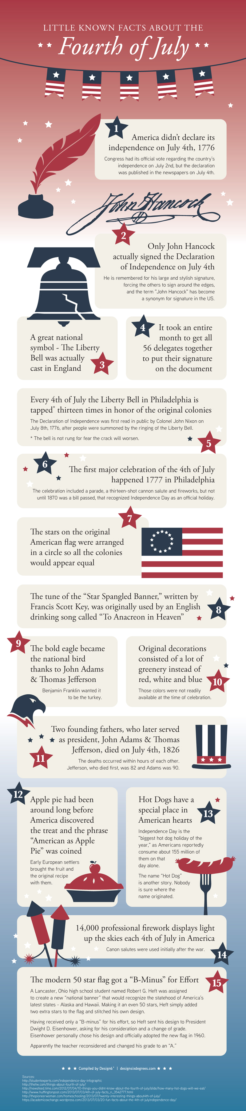
Proclaiming Independence
While we celebrate America’s birthday with fireworks, parades and barbecues, below are some interesting tidbits about the Fourth of July, that might not be as commonly known…
While we celebrate America’s birthday with fireworks, parades and barbecues, below are some interesting tidbits about the Fourth of July, that might not be as commonly known…
With summer comes the opportunity for marketing approaches that are out of the ordinary. Below are some fun campaigns that took summer refreshment to a new level:
Soda Machine Shower – In 2012 beach-goers in Brazil got to enjoy a refreshing taste of Sprite soda, along with a free shower! Sprite installed a giant (water – not soda) shower on the beach. By giving away samples, combined with the refreshing effects of a cool shower, the brand made people associate the flavor of Sprite with refreshment – a brilliant campaign!
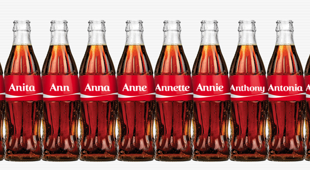
Share a Coke – Beginning in the summer of 2013, Coca-Cola made a big splash when it swapped its famous logo with the most popular names, so people could Share a Coke with the people who matter most.
“The campaign capitalised on the global trend of self-expression and sharing, but in an emotional way. Coke is big enough to pull off an idea like this, which speaks to the iconic nature of the brand.” – Marketing Director Lucie Austin
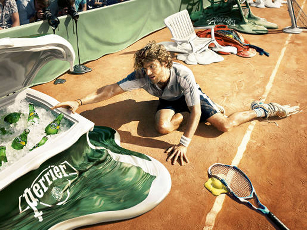
Heat Resistant Water – Back in 2009 Perrier presented itself as the drink that can withstand melting temperatures. Bottles of Perrier appear as cool as ever in the heat blistering environments of the tennis court, the night club and beach. The campaign won a Silver Press Lion at Cannes International Advertising Festival 2009.
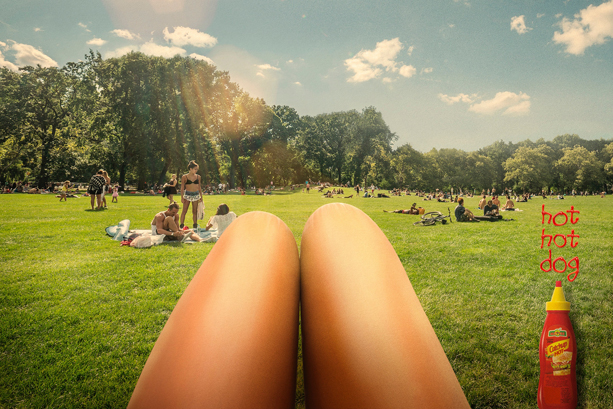
Hot Dog Legs – Not a beverage advertisement, but one that plays on a favorite summer meme, Mettre Alimentos based its summer ads on the “hot dog legs.”
Coke image via Share A Coke | Perrier image via The Inspiration Room | Mettre Alimentos image via Creative Awards
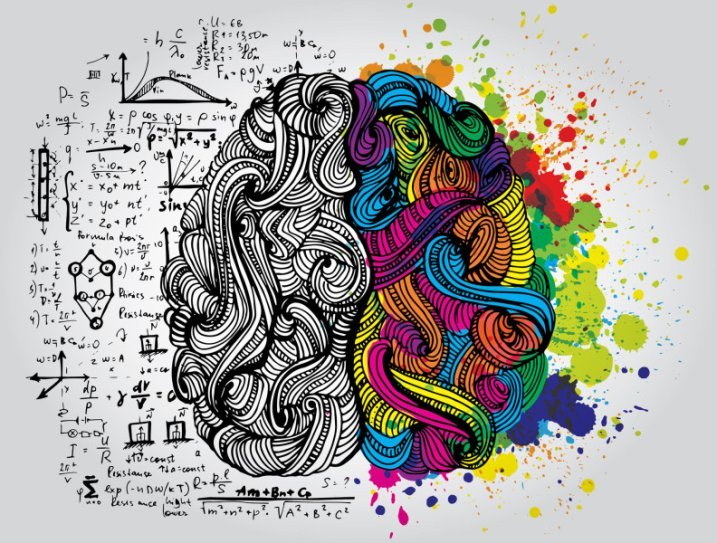
Recently the Benchmark Reporter covered a new Scandinavian study, published in Nature Neuroscience, which shows a genetic link between creativity and psychiatric disorders.
The results of the study revealed that people belonging from these artistic societies had 17% more chances of variants connected with mental health conditions compared to general people.
Study author Kari Stefansson, the founder and CEO of deCODE, a genomic analysis company, stated, “The results of this study should not have come as a surprise, because to be creative, you have to think differently from the crowd. And we had previously shown that carriers of genetic factors that predispose to schizophrenia do so.”
Of course this study was not the first to explore the subject, as there have been many others. One notable contributor would be Nancy C. Andreasen, a leading neuroscientist who has spent decades studying creativity and the origin of genius and why it is so often accompanied by mental illness.
For more on the subject, check out “Secrets of the Creative Brain” by Nancy C. Andreasen or learn more about the Scandinavian study here. For a correlation between creativity and boredom watch this video.
Image via Benchmark Reporter | Video is a preview of a PBS News Hour segment about Nancy Andreasen via The Atlantic
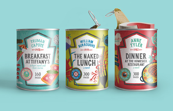
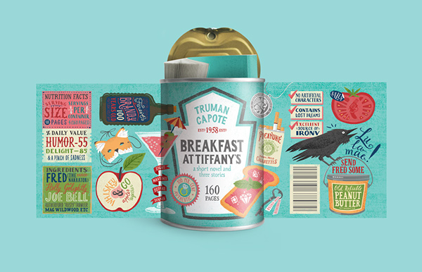
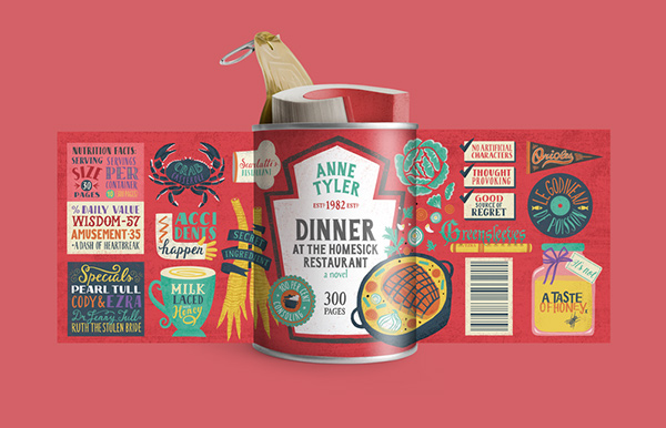
We are all familiar with the English idiom “don’t judge a book by its cover” and while the metaphorical phrase applies to lots of aspects of life, I am certainly one to judge books by their outward appearance alone.
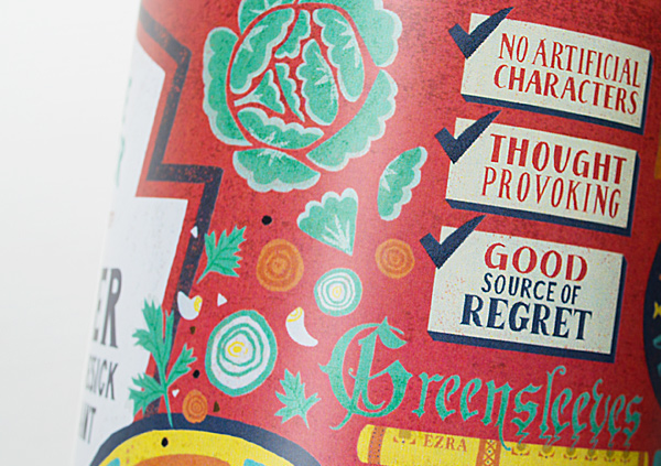
Having said that, Maria Mordvintseva-Keeler’s Food for Thought Book Collection, which includes “Breakfast at Tiffany’s,” “Naked Lunch” and “Dinner at the Homesick Restaurant” in a tin can packaging, is most certainly a feast for the eyes.
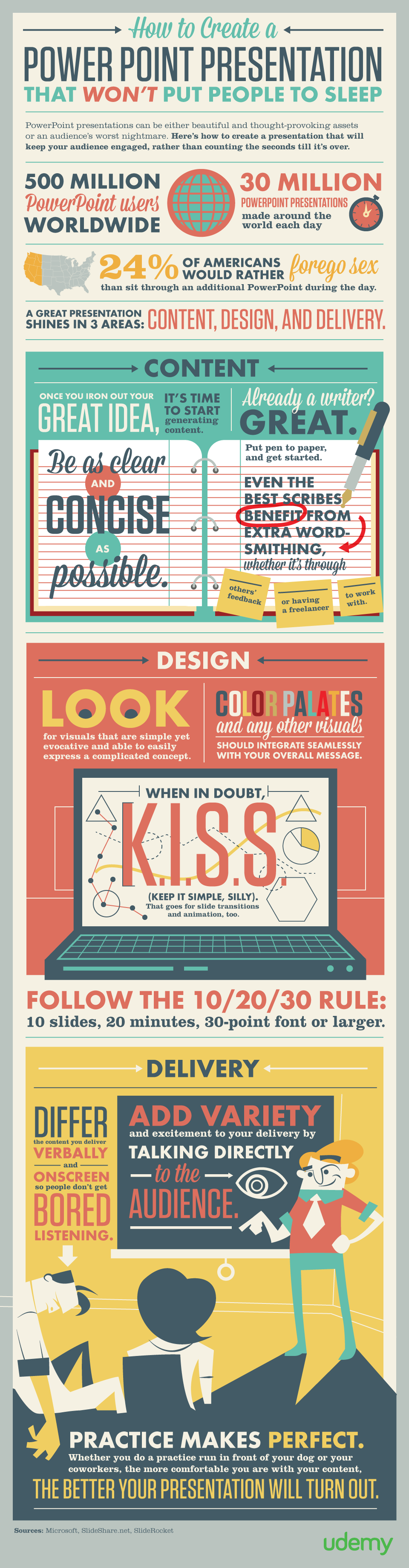
While plenty of PowerPoints presentations have a reputation to bore people to tears, they are still widely used to distribute information. And a great presentation can get the point across, while holding the audience’s attention. To help out, Udemy, the place to learn real world skills online, put together this infographic:
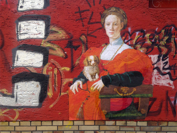
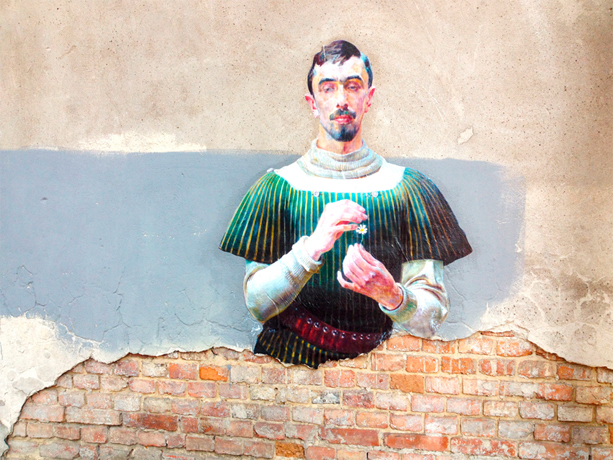
The Outings Project was started by the artist and filmmaker Julien de Casabianca, after he visited the Louvre last year, noticing a lone painting in a back corner. Wanting to get the painting seen and appreciated by people who may never visit the museum, he made a copy of the painting and pasted it on a public street.
Since setting free the first painting, people in several cities have followed suit, turning this into a participative project, which Casabianca says, was not the original idea, but one he embraces.
Below are some favorites that have popped up in the project gallery:
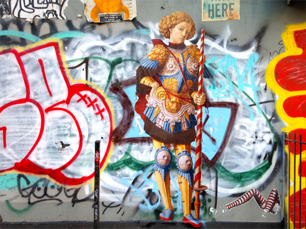
New York, USA – The Metropolitan Museum of Art
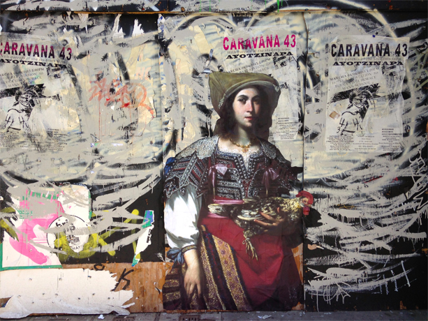
San Francisco, USA – De Young – Legion of Honor, Fine Art Museum of San Francisco
Frankfurt, Germany – Städel Museum
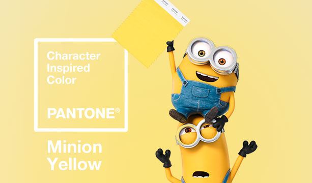
Pantone announced the release of its newest color – Minion Yellow – based on the bespectacled and bright yellow little creatures in the Despicable Me movies, which marks Pantone’s first ever movie-inspired color release.
“Color is contextual and right now there is a desire for colors that are more vibrant and uplifting,” Pantone Color Institute vice president Laurie Pressman said in a news release. “This is especially the case with the yellows, so given the worldwide popularity of the Minions, it seemed only natural to name a color after a character for the first time in our history.”
For obvious reasons this is another color we can give two enthusiastic thumbs up.
Minions picture was created with image from Pantone Color Institute

The ad for F. Scott Fitzgerald’s novel. April 9, 1925 (The New York Times/TimesMachine)
Fitzgerald’s The Great Gatsby, which has been called the great American novel, was published 90 years ago yesterday. The day before its launch, the above ad was published among many others. (See the full issue at TimesMachine.)
Although the book received a strong review in the Times and later got a larger ad, The Great Gatsby was not the success it eventually became during Fitzgerald’s lifetime. According to Vox, until his death Fitzgerald had earned a little over $13 in royalties in addition to his $2,000 advance. For comparison – the most recent Great Gatsby movie took in more than $351 million in theaters worldwide.

The full page on April 9, 1925, with an ad for The Great Gatsby tucked away. (The New York Times/TimesMachine)
Last week Photoshop, Adobe’s photo editing software, celebrated the 25th anniversary of the release of it’s first version. The program is a standard in the design industry and “Photoshop” has come to be synonymous with image manipulation. (Photoshop, the verb, was added to the Oxford English Dictionary back in 2006.)
To celebrate the tool that has helped shape creativity, artists from all over the world contributed their most amazing dreams—and their working files with layers for the following video Adobe put together:

“This hearty, yet stylish tone is universally appealing and translates easily to fashion, beauty, industrial design, home furnishings and interiors.”
– Leatrice Eiseman, Executive Director, Pantone Color Institute®
Pantone’s color of the year – Marsala (PANTONE 18-1438) – named for the red wine with it’s sophisticated, natural earthiness, is one color I can whole heartedly embrace. Unlike last year’s pick, Radiant Orchid, a fuchsia-pink-purple (PANTONE 18-3224) or 2013’s Emerald Green (PANTONE 17-5641), this year’s color has been part of my personal color scheme for years. This beautiful, rich color is extremely versatile, while radiating warmth.