Pantone Colors of the Year – Rose Quartz & Serenity

Pantone Colors of the Year - Rose Quartz and Serenity

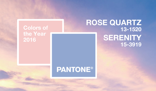
The Pantone Color Institute® – always up for a surprise this year – for the first time announced two colors of the year for 2016. While they are called “Rose Quartz” and “Serenity” they might have come straight from a baby announcement, as they are essentially shades of light pink and baby blue.

While Christina Binkley from the Wall Street Journal joked “It’s twins!” Pantone insists that is not the case.

“Rose Quartz is a persuasive yet gentle tone that conveys compassion and a sense of composure. Serenity is weightless and airy, like the expanse of the blue sky above us, bringing feelings of respite and relaxation even in turbulent times. … Joined together, Rose Quartz and Serenity demonstrate an inherent balance between a warmer embracing rose tone and the cooler tranquil blue, reflecting connection and wellness as well as a soothing sense of order and peace.” Leatrice Eiseman, Executive Director of the Pantone Color Institute was quoted on the company’s website.

Quite different than Benjamin Moore’s choice for the Color of the Year – Simply White – or Sherwin-Williams 2016 pick of Alabaster.

2017-05-22T13:16:58+00:00 December 3rd, 2015|Design, In The News|Comments Off on Pantone Colors of the Year – Rose Quartz & Serenity

Thanksgetting, Really?

Black Friday kicked off the countdown to the Holidays, with the official start of the shopping frenzy, followed by Small Business Saturday and Cyber Monday.

But in recent years Thanksgiving has been losing more and more ground, with retailers opening their doors earlier each year, cutting into the time people used to spend gathered around the dinner table, listing the things (or people) they were thankful for.

While some stores took a stand and decided to stay closed for the holidays this year, one retailer’s message was simply a reflection of greed. Verizon’s message was “Thanksgetting – Get more for the Holidays.”

Thanksgetting via Verizon

It’s one thing for businesses to always be thinking about the bottom line, they want to stay in business after all, but to be so blatant … it’s not really in the spirit of the holidays.

What do you think – is honesty the best approach?

Image via Verizon

2017-05-22T13:16:58+00:00 November 30th, 2015|Design|Comments Off on Thanksgetting, Really?

Happy Thanksgiving

thanksgiving

As we come together between parades and pumpkin pie, in small gatherings or crowds, we give thanks – taking a moment to marvel in all the things we tend to take for granted.

Wishing you a happy and healthy Thanksgiving.

2017-05-22T13:16:58+00:00 November 26th, 2015|Design|Comments Off on Happy Thanksgiving

Unexpected Art Encounters

There is no shortage for outdoor art experiences this year. Earlier this year we mentioned how “The Outings Project” was putting paintings on the street, this summer Longwood Gardens brought us “Nightscape: A Light and Sound Experience” and the Philadelphia Museum of Art is sharing some of it’s masterpieces in a series called “Inside Out” in the borough of West Chester (among other places).

Inside Out - Art in West Chester

“Manne-Porte, Étretat” – Claude Monet  |  “Pichincha” – Frederic Edwin Church  |  Sketch for “A Boat Passing a Lock” – John Constable  |  “Two Dragons

[in Clouds]” – Kano Hōgai  |  “Groundhog Day” – Andrew Newell Wyeth  |  “Little Painting with Yellow (Improvisation)” – Vasily Kandinsky

The open air exhibit is part of a series throughout the Greater Philadelphia region, which lets you encounter art in unexpected places and includes works by Andy Warhol, Claude Monet, Vasily Kandinsky, Paul Klee and Thomas Eakins.

Video via Philadelphia Museum of Art

In addition to providing free art in the borough, the Museum is offering West Chester residents free general admission to the Museum from Friday, October 16, through Sunday, October 18, 2015.

2017-05-22T13:16:58+00:00 September 28th, 2015|Design, Inspiration, Local, Videos|Comments Off on Unexpected Art Encounters

Upscale Thrift

Goodwill, which is funded by a massive network of retail thrift stores, is not usually associated with high end brands, but rather affordable prices. To set itself apart from increased competition in the thrift store market, Goodwill is taking a new approach by opening select boutique style stores, which are designed to feel more like Urban Outfitter or Anthropologie rather than a thrift store.

RARE Storefront (The Suitcase Studio)

Rare by Goodwill is the nonprofit’s latest retail experiment. (David Kawashima / The Suitcase Studio)

One of the OC Goodwill's boutique stores, located in Huntington Beach, CA. (David Kawashima / FastCompany)

One of the OC Goodwill’s boutique stores, located in Huntington Beach, CA. (David Kawashima / FastCompany)

Over the last four years Goodwill has opened approximately 60 such stores across the country, trying to take advantage of luxury donations and to appeal to a broader audience. Prices are slightly higher than regular Goodwill prices, but still beat the price tag high end name brands, such as Prada, Chanel, Burberry or Ralph Lauren would fetch at traditional retailers.

The O.C. Goodwill Boutique in Huntington Beach features wooden floors and artfully arranged clothing displays. (Allen J. Schaben / Los Angeles Times)

The O.C. Goodwill Boutique in Huntington Beach features wooden floors and artfully arranged clothing displays. (Allen J. Schaben / Los Angeles Times)

Frank Talarico Jr. of the Goodwill in Orange County, was quoted in the LA Times saying: “The boutiques set us apart. This is a really nice way to expand. We are definitely not going to stop.” Adding “The only reason retail is relevant is because we are using the money to serve.”

2017-05-22T13:16:58+00:00 September 21st, 2015|Big Thinking, Design, In The News|Comments Off on Upscale Thrift

Oktoberfest Is Upon Us

2015 Oktoberfest Jugs - via LA Times - Sven Hoppe / EPA

Image of Oktoberfest celebration in Munich, Germany via LA Times. (Sven Hoppe / EPA)

Oktoberfest isn’t just celebrated in Bavaria anymore, but the official opening of THE Oktoberfest is happening this weekend in Munich with much fanfare and keg tapping.

What started out as celebration of the marriage of Prince Ludwig of Bavaria to Princess Therese of Saxony-Hildburghausen on October 12, 1810, has grown into the world’s largest folk festival and attracts around six million visitors annually.

Those visitors will be greeted by the official poster – designed by one of several invited contributors – a tradition of its own, in which participants can submit two ideas for the year’s official signage for review by a jury.

This year’s participants came from art & design schools or have previously won some prize or award to qualify for submission. The winning design was submitted by Moritz Breitenhuber from Akademie U5 München and will be on 100,000 brochures and 10,000 posters across Munich this September. It will also be on this year’s official collector jug, shown in the picture above.

Below is this year’s official poster, as well as a selection from the past 60+ years.

Want to learn more about the history or why Oktoberfest is in September? Go here.

The Oktoberfest in Munich runs from September 19 until October 4, 2015.

Image of Oktoberfest Posters via muenchen.de

2018-03-21T15:31:03+00:00 September 14th, 2015|Design|Comments Off on Oktoberfest Is Upon Us

The IKEA Catalog Got a Formal Review

IKEA has been known to come up with creative ways to promote it’s catalogs and store openings. And this year was no different. IKEAS Switzerland (Agency: Wirz Werbung Zürich) got Germany’s famous literary critic Hellmuth Karasek to review the catalog like any other piece of literature, since it is the most widely distributed “book” in the world.

“It is a furnished novel,” he says tongue-in-cheek. “The characters are forced to crowd themselves between the furniture, they seldom get their say, they barely speak coherently — and yet this work has become such a success.”

2017-05-22T13:16:58+00:00 September 8th, 2015|Big Thinking, Design, Humor, In The News, Videos|Comments Off on The IKEA Catalog Got a Formal Review

Google’s New Logo

Google's New Logo

Google’s homepage introduced a new sans-serif logo today – the biggest redesign since 1999. Small screens and readability on all devices have been a major consideration, with modern typography (a new Google specific font called Product Sans) that scales better to smaller sizes for easier reading.

“This isn’t the first time we’ve changed our look and it probably won’t be the last, but we think today’s update is a great reflection of all the ways Google works for you across Search, Maps, Gmail, Chrome and many others. We think we’ve taken the best of Google (simple, uncluttered, colorful, friendly), and recast it not just for the Google of today, but for the Google of the future” the company stated on it’s blog.

Google also changed their icon – instead of the blue “g” – an uppercase “G” in Google’s four colors will be displayed, which many are saying will become “people’s primary association with Google going forward.”

The video below recaps the evolution of Google and it’s logo – the way people interact with Google today across many different platforms, apps and devices.

New logo animation & video via Google

2017-05-22T13:16:58+00:00 September 1st, 2015|Big Thinking, Design, In The News|Comments Off on Google’s New Logo

Nightscape: A Light and Sound Experience.

Longwood Gardens is giving visitors a chance to explore its grounds after dark and experience a stunning installation by Philadelphia based Klip Collective, that combines moving images and lights choreographed to music in several areas of the garden.

Ricardo Rivera talks about the conception of Nightscape on Longwood Gardens’ blog, when the Klip Collective years ago created a one-hundred-foot wide veil of smoke in a meadow, to project franticly dancing fireflies, that where to be viewed from a distance.

“To our surprise, people walked right into it. The audience wanted to be surrounded and lost in the chaos of the moment. Seeing how people were drawn to the lights and how they reacted to the experience inspired me to explore the idea of experience as art … and that began the process for Nightscape.”

While the video Longwood Gradens produced is truly amazing, it only gives a glimpse of the beauty. It is only in person that you can truly experience this awe-inspiring presentation. The drumming topiaries were fascinating, but the best part for me personally, was the change of the seasons above the lake.

The installation is on view Wednesdays through Saturdays, until October 31st.

2017-05-22T13:16:58+00:00 August 24th, 2015|Design, Local, Shows, Videos|Comments Off on Nightscape: A Light and Sound Experience.

First Class Design

How cool would this have been? A small post office in Tieton, Washington was supposed to get a new facade consisting of 41,500 stamp-size glass mosaic tiles, commemorating the look of vintage postage stamps from the early 20th century.

Tieton Post Office Design

Image via Kickstarter | Tieton Stamp Mosaic: A Monument to Small-Town Post Offices

The Kickstarter campaign had initially raised enough money, but the USPS declined the offer, with Ernie Swanson, U.S.P.S. communications field contact, stating “It’s just inappropriate, basically, for us to do that, to accept such gifts; we operate and maintain our own facilities.”

Luckily the town will still produce six typographic mosaics that will be installed around Tieton landmarks, as part of the Tieton Mosaic Project, which was funded in part by the National Endowment of the Arts. Ed Marquand, co-founder of Mighty Tieton (an incubator for artisan and design-related light manufacturing businesses), is behind the Tieton Mosaic Project and helming the revitalization effort of the small, agricultural community in central Washington.

2017-05-22T13:16:59+00:00 July 29th, 2015|Big Thinking, Design, In The News|Comments Off on First Class Design